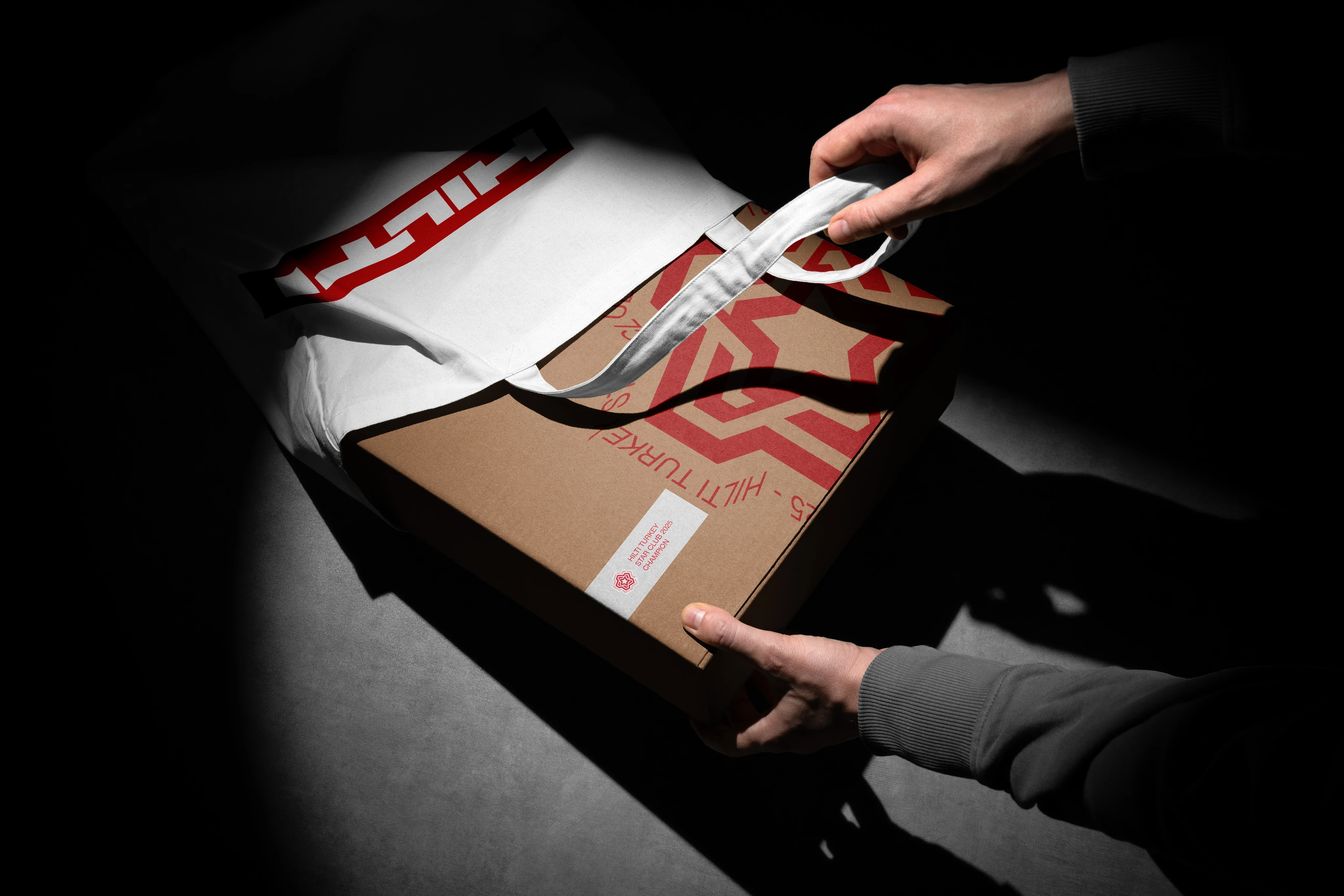

The first pack is a poor judge of a packaging system. It is usually designed under unusually favourable conditions: the team is focused, the content is controlled, and enough time is available to resolve every visible detail. Under those conditions, even a fragile structure can look convincing.
The sixth pack is more honest.
By then, the product name may be longer, the preferred colour may sit too close to an existing one, the pack size may have changed, and the amount of mandatory information may have doubled. A premium edition, a regional version or a neighbouring category may also have entered the family.
At that point, isolated design decisions are no longer enough. The structure either absorbs the new product or starts to break.
The Sixth Product Test is a practical stress test for one question: did we design a packaging system, or only a successful first composition?
What the test measures
The method asks the designer to invent a product that does not yet exist and force it through the proposed system. It is a practice-based diagnostic, not a universal standard or a substitute for research. Its value is narrower and more useful: it reveals which decisions only work because the first product was unusually convenient.
Packaging research has repeatedly treated the pack as a cross-functional object rather than a decorative surface. It affects marketing, product development, production, logistics and the way a brand is interpreted. A packaging system therefore has to survive more than a front-facing mock-up.1
A useful test product should be deliberately awkward. Give it a longer name. Choose a colour close to an existing variant. Add another language or more legal copy. Reduce the format. Change the material. Make it a premium edition or move it into an adjacent category.
Then solve it without inventing a new visual language.
What fails first is usually informative. It may be the hierarchy, the colour code, the naming structure, the image area, the side panel or the relationship between brand and product information. The test converts a vague concern about future growth into a visible design problem.
Design the family, not the box
Most packaging projects begin with a single product. That is normal. The mistake is allowing the first product to define the entire system without considering what may follow.
At the beginning of the process, map the likely directions of growth: flavours, sizes, formulas, materials, seasonal editions, premium lines, regional versions and adjacent categories. This is not a forecast. It is a map of the kinds of variation the design may have to carry.
A packaging family has to answer two questions at the same time:
• How will this product clearly belong to the family?
• How will it keep enough character to be found and chosen within that family?
If every pack is too similar, selection becomes difficult. If every pack behaves like a separate brand, recognition disappears. The work lies in setting the right distance between continuity and difference.
Research on holistic package design also shows that combinations of colour, form, typography and imagery contribute to brand impressions as a whole. This is why changing one element cannot be evaluated in isolation from the rest of the system.3
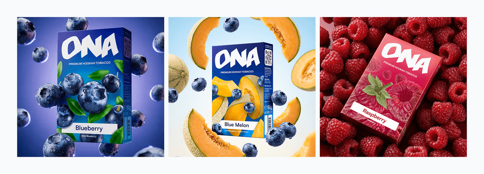
Ona Tobacco Rebranding and Packaging
A system is not a template
A template can specify where the logo sits, how large the image is and how much space surrounds the product name. That order is useful, but it does not explain how the design should respond when conditions change.
A system defines relationships. It identifies what must remain stable, what may change, and how far that change can go before the identity is lost. It also explains which second signal should take over when the first one is no longer sufficient.
Consider a family in which every flavour is assigned a colour. The colour choice alone is not yet a system. Where does the colour appear? How much of the surface can it occupy? What happens when two flavours need similar colours? Which second cue separates them? Does the logic still work when the family grows from six products to twelve, or when production changes the colour result?
A template places elements. A system preserves the reasoning behind their relationship.
Three communication layers
A practical way to examine a packaging system is to separate it into three working layers: recognition, navigation and expression. These are not fixed aesthetic rules. They are roles that help clarify what each element is expected to do.
Recognition
Recognition tells the viewer that different products belong to the same brand or family. The logo, typography, overall proportions, repeated forms, information structure and use of space may all contribute.
These elements do not have to remain identical on every pack. They do need enough continuity to preserve the family connection when the format, image or colour changes.
Navigation
Navigation helps the user find the right product. Colour, naming, numbering, imagery, icons, patterns and structural differences can separate flavours, sizes and categories.
This distinction must be quick. A user should not have to read every line of copy to tell two nearby variants apart. At the same time, the differentiating element should not become so dominant that each product starts to look like a separate brand.
Imagery can attract attention and support product interpretation, but its effect depends on context and brand familiarity. It should therefore be assigned a clear role rather than treated as an automatic solution.4
Expression
Expression carries the character of the product. Material, illustration, photography, surface treatment, verbal tone, CGI, light and motion may all contribute.
This layer usually has the greatest freedom. A limited edition or a premium product may need a different tone. That freedom should still operate inside the recognition and navigation logic.
Separating the three roles makes the discussion more precise. It becomes easier to see which elements protect the brand, which organise the range, and which give an individual product its voice.
Operational constraints sit around all three layers
Recognition, navigation and expression describe what the packaging communicates. They do not remove the practical conditions in which the pack must be produced and used.
Mandatory information, barcodes, language changes, print tolerances, material behaviour, finishing, pack geometry, transport, e-commerce crops and regional regulations all place pressure on the visual system. A design that survives only in a perfect render is not yet a reliable packaging system.
This is one reason packaging development needs input from more than the design team. Production partners, legal teams, product managers, retailers and distribution channels may each expose a different weakness.2
From components to family
Brad Frost’s Atomic Design was developed for interfaces, but one part of its logic transfers well to packaging: a system should be understood as both a set of components and a complete experience. Real content and variation are used to test whether the underlying structure is resilient.5
In packaging, small decisions determine how the whole family behaves. Typography is not only a typeface choice; it is the relationship between brand name, product name, claim, mandatory information and secondary copy. Colour may identify flavour, category or hierarchy. Naming length affects layout. Material affects contrast. An icon may work at thumbnail size but fail in print.
The identity is not created by any one component. It is created by the relationships among them.
Define constants, variables and dependencies
A scalable system needs more than a list of fixed and flexible elements. It also needs to show how those elements depend on one another.
Constants carry recognition: the main hierarchy, logo relationship, core proportions, naming logic or a repeated structural gesture. Variables create difference: colour, flavour image, material, secondary typography, pattern or tone. Conditional elements appear only under certain circumstances, such as a language block, certification mark or premium finish.
The useful question is not simply “What changes?” It is “What job does each change perform, and what happens when it cannot perform that job?”
If colour identifies flavour, the system needs a backup when two colours become too similar. If the product image carries most of the expression, the design needs a plan for variants without a clear visual subject. If the logo only works at one scale, the system needs another recognition cue for small formats.
When two variables perform the same job, the system becomes noisy. When one variable is expected to perform too many jobs, it becomes fragile.
Where packaging systems usually fail
The Sixth Product Test becomes more useful when the team knows what to look for. Common failure patterns include:
• Hierarchy collapse: the longer name or additional information has nowhere to go without weakening the main reading order.
• Differentiation collision: two variants become difficult to distinguish because the system relies on similar colours, names or images.
• Single-signal dependence: one element is carrying recognition, navigation and expression at the same time.
• Format drift: the design works on the original pack but loses its identity on a smaller, taller or structurally different format.
• Exception inflation: every new product requires another special rule until the rules no longer describe a system.
• Channel breakdown: the pack is convincing in a hero render but becomes unclear as a thumbnail, side view, shelf line-up or moving image.
A failure is not a reason to abandon the system. It identifies the rule that needs to be clarified, simplified or given a second layer of support.
How to run the Sixth Product Test
The test is most useful before final approval, while the system can still be changed without turning every correction into production rework.
Quick protocol
1. Map the current family and the most likely forms of growth.
2. Assign every major element a role: recognition, navigation, expression or operational support.
3. Create a difficult sixth product with at least three new constraints.
4. Prototype it in the family, at thumbnail size, on a secondary panel and in one non-static context.
5. Mark each issue as stable, under pressure or failing; revise the rule rather than patching only the new product.
The test product should feel plausible, not absurd. A useful combination might be a smaller pack with a longer bilingual name and a colour close to an existing variant. Another could be a premium edition that needs a different material while carrying more regulatory information.
The prototype does not have to be a polished client presentation. A realistic draft is enough. The value lies in making uncertainty visible.
Stable, under pressure or failing
Use three simple labels during review. Stable means the new product fits without weakening the system. Under pressure means the design still works, but the rule is ambiguous or close to its limit. Failing means the product can only be added by contradicting the existing logic or inventing a separate identity.
The middle category matters. Most systems do not collapse at once; they accumulate unresolved tensions. Catching those tensions before production is the practical advantage of the test.

Korodo® Branding and packaging
What the test does not replace
The Sixth Product Test checks structural capacity. It does not replace user research, shelf testing, regulatory review, accessibility checks, prepress proofing, material trials or production prototypes.
It also does not prove that a visual direction is strategically correct. A system can be internally consistent and still communicate the wrong position. Research and testing are needed to examine interpretation; production work is needed to examine feasibility. The Sixth Product Test sits between those activities. It asks whether the chosen design logic can survive realistic growth.
Packaging does not end on the shelf
A product may now be seen on a phone before it is seen in a store. The first encounter may happen in an online shop, a campaign image, a social post, a launch film or a CGI sequence.
The system therefore has to work at different distances and in different media. At thumbnail size, the main structure and identifying signals should remain visible. At close range, the details should justify their presence. When several products appear together, the family relationship should remain clear.
CGI and motion should not be added as decorative layers after the packaging is complete. If they are part of the product’s communication, their requirements should influence the design from the beginning.

DUSK® Branding and Packaging
Motion is a stress test for identity
A still image allows the designer to choose an ideal angle, control the light and keep unresolved areas outside the frame. Once the camera moves, the pack is seen from the side, back, top and close range.
The questions become unavoidable:
• Is the product still recognisable when the front panel is not visible?
• Does the information hierarchy survive a close shot?
• Does the family remain coherent when several packs enter the frame?
• Do the camera movement, lighting and effects belong to the brand’s tone?
Motion is useful because it tests more than visual polish. It reveals whether the packaging has enough structure to remain itself while the viewing conditions change.
Designing for the product that has not been made yet
Packaging gives a product shape in the user’s mind. It creates signals about quality, position, use and character. When several products sit together, those signals form a larger picture of the brand.
The designer’s responsibility is to build that larger picture, not only the first box.
The Sixth Product Test does not promise to predict every future problem. It checks whether the current design has enough capacity, redundancy and clarity to deal with change.
The first pack may show how well a designer can compose. The sixth shows whether the designer has built a system.
The goal is not to know exactly what the future product will be. The goal is to make sure the identity does not have to start again when that product arrives.
References